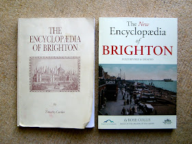
The new version is a pleasure to pick up and handle. The cover appears to be more durable and the paper is smooth making it easy to leaf through; the print is sharp and clear, arranged in two columns, and attractively interspersed with motifs and illustrations. I particularly liked the old street maps reproduced on the inside of the front and back covers
Detailed variations between the two versions will only become clear with extended use but here are a few of the points that have already come to light:-
- There are many more articles (394) in the new version compared with the original (216).
- Whereas the original version was mainly topographical in layout, the new version seems to have abandoned this approach and contains many more articles on people, events and social phenomena.
- Some of material imported from Timothy Carder's work has been heavily abridged.
- The new version contains no list of figures and no separate Index to People.
- The articles are now indexed conventionally by page numbers rather than serial numbers and consequently are easier to find.
- The new version appears not to have been indexed in the same depth as the original. Whereas the original General Index (excluding people) had about 3000 entries with much cross-referencing, the new version has only about 1000 entries which includes people. The extent to which this matters, bearing in mind the greater number of articles, will perhaps depend on the kind of use to which one wants to put the Encyclopaedia.
I will certainly be using them in parallel for the forseeable future.

No comments:
Post a Comment
In event of difficulty in adding comment, email:- quedula@gmail.com